Product Training for New Hires
See It
Overview
The audience for this project could be retail staff, affiliate marketers, or anyone who needs to learn the features of Apple products. The project was a hiring exercise, however, the business needs for the client’s future projects were real:
- Learners would be at different skill or knowledge levels.
- There was a large backlog of training needs.
It’s a waste of everyone’s time to produce bullet-heavy, click-next eLearning, even though it would quickly put a dent in the backlog. This kind of eLearning damages the credibility of your training department and company leadership, de-motivates learners, and frankly does not work.
Other passive learning experiences such as recorded non-interactive lectures, voice-over with decorative images, and under-designed reading assignments and video content can also be in this category of ineffective and potentially damaging digital learning. It’s my strong opinion that there is no business justification for “edutainment” like this.
Another pitfall when facing a backlog is trying to cram too much content into one module. People need repetition in order to learn. Unfortunately, it’s often review and repetition that gets cut when there’s a lot of training to produce. This is a serious mistake.
Solution
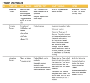
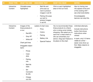
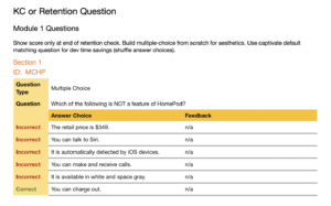
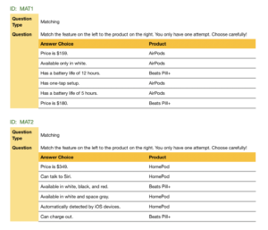
This bite-sized module begins with a 20-second sizzle reel to capture the learner’s attention. The remainder of the content is 100% interactive. The first interaction is an easy exercise that does double duty by providing context. Each activity after that gets progressively more challenging. This requires learners to stay engaged at all times; they must think about the content in new ways even when it’s repeated. This repetition is key for encoding it into long term memory. The eLearning concludes with five high difficulty quiz questions which check that all learning objectives were met.
I designed and developed this prototype in ~18 hours without using any templates. You can create a library of templates and easily develop L2 eLearning like this in half that time. For a group that frequently needs product training, and needs it as soon as new products are launched, this would be a smart approach.
This kind of design accommodates learners at different levels of skill or knowledge. Everyone can move through the eLearning at their own pace, and advanced learners will not be spoon-fed information they already know. Rather, it’s a helpful and quick review exercise to them.
Better with sound
Note: For this portfolio piece, I’ve created an example of a solution to a common business problem. I’ve outlined how I would approach the problem, shared an example of my process, and posted the project prototype. This prototype was originally submitted to a tech company as a hiring exercise.
Designing the Whole Solution
Having product knowledge is not, by itself, a business skill. For example, sales people should practice applying their product knowledge in the context of a digital sales scenario experience or live role play led by a certified trainer. A training like this one should always be a part of a robust curriculum that includes contextual challenges and assessments of vital skills.
Process: ADDIE
Since this project was a hiring exercise, my process to design and develop was extremely simple—first I created the storyboard, then I developed the module. Below, I’ll show you how I would approach a project like this as an instructional designer working with a production team consisting of a graphic designer, a multi-media developer, and an eLearning developer.
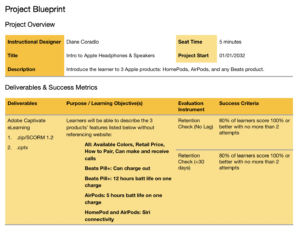
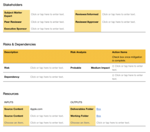
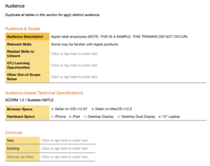
During the Analysis phase, I research the topic, including interviewing SMEs, and create learning objectives that align to a business goal. An evaluation plan is drafted that includes evaluation instruments and success criteria. I analyze the organization, audience, project constraints, and relevant contexts. A project blueprint is approved before the Design phase begins.
I create a detailed storyboard in order to:
- gain approval of stakeholders on content, including wording;
- enable the graphic designer to source assets;
- enable the multi-media developer to develop assets;
- enable the eLearning developer to build it correctly the first time.
While the storyboard is out for review, I work with the graphic designer to create samples of the look and feel, including navigation elements, imagery, charts, and a few layouts. Unless the client has been extremely specific about their visual design preferences, I present one or two alternative options for key decisions. If any interactive graphics are included in the storyboard, these are prototyped only after the storyboard is approved.
Functional prototypes are not necessary for L2 eLearning unless there is a need to test the LMS or other hosting platform, as when an organization is first launching a digital learning strategy.
Once the storyboard has been approved, the multi-media developer and eLearning developer begin working on anything that is not dependent upon the graphic design decisions.
Once the look and feel is approved, the graphic designer and multi-media producer finish sourcing and building out assets. The eLearning developer quickly swaps out placeholders once the assets are completed.
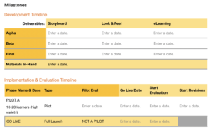
During the first review (Alpha), stakeholders can request any change. Ideally, the prior approval of the storyboard will prevent major change requests. I recommend that all stakeholders participate in this review cycle.
During the second review (Beta), stakeholders validate that changes were incorporated correctly. Proxy reviewers can stand in for busy stakeholders; proxies should make sure they’re clear on their stakeholder’s original feedback.
The final review (Gold) is also a validation only review cycle. Those stakeholders requiring final sign off are now looped back in.
The course is uploaded to the learning platform and verified to be working properly. Learner communications and registrations go out. Learners complete the training. Ideally, at least one pilot group takes the course first so its results (especially job performance metrics) can be compared to a control group that has not taken the training yet. The course should be iterated before launching for the full audience.
The results of the course are compared with the desired results delineated in the Project Blueprint. ROI can also be calculated at this stage. To wrap up the project, this information is reported to stakeholders, and developer notes are added to the project folder before it is archived. Developer notes are helpful for future maintenance projects.

